In the visceral, often uncompromising world of metal, your band’s album art is far more than mere decoration. It is a primal declaration, a silent roar that immediately communicates your sonic creed, your philosophical stance, and, critically, your subgenre. This is the essence of subgenre signalling – the non-verbal contract between your visuals and your audience’s expectations.
Misalign your artwork with your sound, and you risk not just confusion, but alienation. Get it right, however, and your visuals become a powerful amplifier, drawing in precisely the fans who will understand and champion your brutal vision. This piece will dissect the intricate ways visuals communicate subgenre, explore their psychological impact on fans, and guide you in harnessing this power to solidify your band’s unmistakable identity.
The Primal Glare: First Impressions & Tribal Loyalty
Before a single note reverberates, your album art delivers a potent, instantaneous message. This isn’t a conscious decision; it’s a gut reaction. Metalheads are a tribal lot, fiercely loyal to their chosen factions. An album cover doesn’t just present an image; it acts as a banner, a crest, an immediate identifier of belonging. Does this art speak to the darkest corners of their soul, or does it feel alien? That initial glance determines whether a potential fan leans in or swiftly moves on. It’s the first filter in a genre defined by its distinct tribes.
Instinctive Genre Categorization: Before the First Note
Long before pressing ‘play’, our brains are hardwired to categorise. Within the metal sphere, this process is hyper-accelerated. The colour palette, the font choice, the thematic imagery – each element contributes to an immediate, often subconscious, genre assessment. A grim, monochrome landscape adorned with an illegible, spiky logo screams black metal. A grotesque, hyper-detailed gore scene with an intricate, guttural wordmark instantly flags death metal. This swift subgenre signalling isn’t about mere aesthetics; it’s about rapidly processing visual data to predict a sonic experience. Bands that understand and master this visual language gain an immediate advantage, connecting with their target audience before a single waveform is processed.
The Unspoken Promise: What Your Art Guarantees Fans
Your album art isn’t just an introduction; it’s an unspoken promise. It assures the listener of the journey they’re about to embark on. A band promising atmospheric black metal with an image of a sunny beach will inevitably disappoint. Conversely, a cover depicting a crumbling ancient temple filled with Eldritch horrors sets an expectation for crushing doom or technical death metal. This visual guarantee fosters trust and sets the stage for genuine fan connection. When the sound delivers on the visual promise, the bond strengthens, affirming the fan’s decision to invest their time and ears.
Beyond Aesthetics: The Semiotics of Brutality
To truly master your metal branding, one must delve into the semiotics of brutality – the study of how signs and symbols convey meaning within our subculture. Every skull, every chain, every arcane symbol carries a specific cultural weight and historical context. Understanding these visual archetypes allows bands to communicate complex ideas and genre affiliations without uttering a word. It’s a sophisticated form of visual communication that transcends simple ‘coolness’ and taps into the collective unconscious of the metal community.
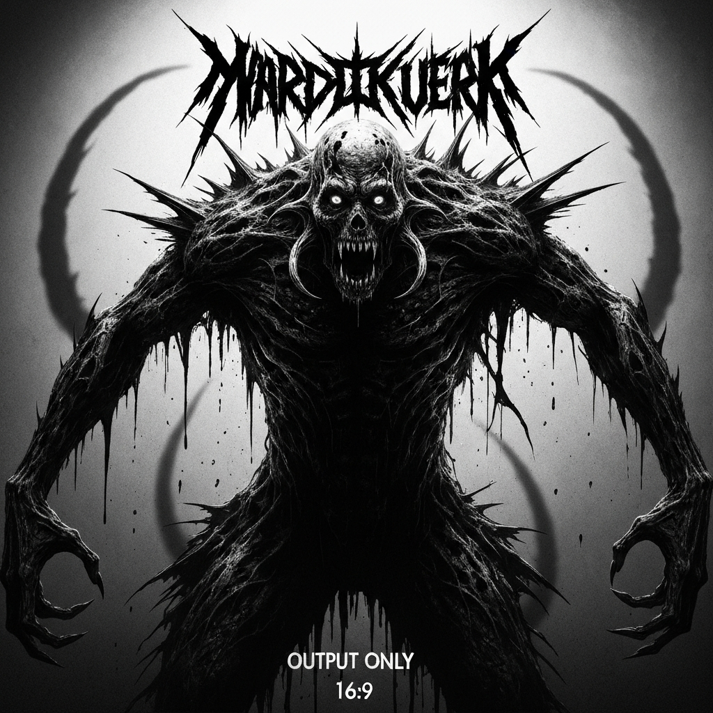
Death Metal’s Guttural Grime: Iconography & Expectation
For death metal, the iconography is uncompromising: rotting corpses, visceral gore, dismembered anatomy, infernal entities, and often intricate, barely legible logos that resemble tangled barbed wire. The colour scheme often leans towards muted, decaying tones, or stark reds and blacks. These elements don’t just look ‘heavy’; they promise a sonic assault of guttural vocals, relentless blast beats, and often complex, brutal riffing. It’s an aesthetic that demands a certain level of commitment and promises an unflinching exploration of death, suffering, and existential dread.
Black Metal’s Frozen Frights: Ambience & Authenticity
Black metal’s visual lexicon is typically steeped in grimness and atmosphere: desolate, snow-laden forests, ancient ruins, shadowy figures, and often imagery tied to paganism, anti-Christianity, or misanthropy. Monochrome or desaturated colour palettes are common, conveying a sense of coldness, isolation, and despair. The logos are often spiky, thorny, and difficult to decipher, adding to the mystique. This aesthetic prepares the listener for raw, atmospheric, often lo-fi soundscapes, tremolo picking, blast beats, and shrieking vocals – a journey into the bleakest corners of human and natural existence.
Prog Metal’s Cosmic Canvas: Complexity & Intrigue
Progressive metal embraces a broader, more expansive visual language, often featuring intricate, fantastical landscapes, cosmic vistas, futuristic cityscapes, or abstract, geometric designs. The colour palettes can range from vibrant and ethereal to stark and technological. Logos tend to be cleaner, more legible, and often incorporate symbolic elements. This visual style communicates a promise of sonic complexity: technical musicianship, unconventional song structures, conceptual themes, and often epic, sprawling compositions. It invites intellectual engagement as much as headbanging. To explore the vast lexicon of metal aesthetics and find art that screams your subgenre, explore our collection of ready-to-use metal artwork.
The Double-Edged Sword: When Art Mismatches Sound
While the right artwork can be your greatest asset, a mismatch can be a devastating liability. When the visual promise fails to align with the sonic reality, you’re not just creating inconsistency; you’re actively undermining your band’s credibility. It’s like turning up to a black metal ritual in a Hawaiian shirt – profoundly out of place and confusing to all involved. This dissonance creates a barrier, rather than an invitation, for potential fans.
Confusion Kills: Lost Fans, Missed Gigs
The consequences of visual confusion are tangible. Potential fans scroll past your music because the cover doesn’t resonate with their preferred subgenre. Journalists might miscategorise your band, leading to inappropriate reviews. Promoters might overlook you for gigs because your visual identity doesn’t fit the bill. In a crowded scene, clarity is paramount. Every confused click or dismissive glance represents a lost opportunity – a fan who never heard your music, a gig you never played, a sale you never made. Your artwork, in essence, is your frontline ambassador; if it misrepresents, it fails.
The Power of Alignment: Amplifying Your True Sound
Conversely, when your visuals perfectly align with your sound, the effect is synergistic. The artwork amplifies your music’s impact, creating a cohesive, immersive experience that resonates deeply with your audience. It validates their expectations, draws them further into your world, and reinforces your artistic vision. This alignment isn’t just about looking good; it’s about creating a powerful, singular identity that is instantly recognisable and deeply magnetic.
Visual Purity: Choosing Art That Speaks Your Subgenre
Achieving visual purity in your metal branding means being intentional and uncompromising. It demands a deep understanding of your band’s core sound, lyrical themes, and overall philosophy. What emotions do you evoke? What stories do you tell? What traditions do you honour or subvert? The chosen artwork must be an authentic visual extension of these elements, free from extraneous concepts that dilute your message. Purity isn’t about simplicity, but about clarity of intent and an unyielding commitment to your true subgenre identity.
Decoding Visual Language: What Works Where
To practically apply the principles of subgenre signalling, you must become adept at decoding visual language. Understand that stark, minimalist designs often signal a raw, perhaps depressive, black metal or drone aesthetic. Hyper-realistic, grotesque imagery typically points to brutal death metal or grindcore. Abstract, often symmetrical patterns or fantastical landscapes frequently denote progressive or power metal. Research the visual precedents within your specific subgenre and identify the core motifs, colour schemes, and compositional styles that have historically resonated with its audience. Ready to forge a powerful visual identity? Browse our curated selection of metal album art to find the perfect match for your sonic assault.
How Pre-Made Art Solves Identity Crisis Instantly
Navigating the complex landscape of metal aesthetics can be daunting, especially when trying to ensure perfect subgenre signalling. This is where high-quality, pre-made artwork becomes an invaluable asset. Instead of embarking on lengthy, costly custom commissions that may or may not capture your vision, you can instantly browse a curated collection of professional pieces explicitly designed for various metal subgenres. This immediate access to visually potent, genre-appropriate art eliminates guesswork, saves critical time, and allows you to establish a strong, undeniable identity without delay. It’s about leveraging existing artistry to empower your band’s immediate impact.
Unleash Your True Form: Empowering Your Metal Identity
Your band’s visual identity is not an afterthought; it is a foundational pillar of your existence. Mastering subgenre signalling is about more than just looking the part; it’s about forging an authentic connection with your audience, amplifying your sound, and securing your rightful place within the metal pantheon. By choosing artwork that resonates deeply with your sonic essence, you don’t just release music; you unleash a fully realised, visually brutal, and undeniable force.